5.2 属性
使用 attributes 可以创建自定义的图。 设置属性可以使用多个关键字参数。 每个 plot 对象的 attributes 列表可以通过以下方式查看:
fig, ax, pltobj = scatterlines(1:10)
pltobj.attributes
Attributes with 15 entries:
color => RGBA{Float32}(0.0,0.447059,0.698039,1.0)
colormap => viridis
colorrange => Automatic()
cycle => [:color]
inspectable => true
linestyle => nothing
linewidth => 1.5
marker => Circle
markercolor => Automatic()
markercolormap => viridis
markercolorrange => Automatic()
markersize => 9
model => Float32[1.0 0.0 0.0 0.0; 0.0 1.0 0.0 0.0; 0.0 0.0 1.0 0.0; 0.0 0.0 0.0 1.0]
strokecolor => black
strokewidth => 0或者调用 pltobject.attributes.attributes 返回对象属性的Dict 。
对于任一给定的绘图函数,都能在 REPL 中以 ?lines 或 help(lines) 的形式获取帮助。Julia将输出该函数的相应属性,并简要说明如何使用该函数。 关于 lines 的例子如下:
help(lines) lines(positions)
lines(x, y)
lines(x, y, z)
Creates a connected line plot for each element in (x, y, z), (x, y) or
positions.
│ Tip
│
│ You can separate segments by inserting NaNs.
lines has the following function signatures:
(Vector, Vector)
(Vector, Vector, Vector)
(Matrix)
Available attributes for Lines are:
color
colormap
colorrange
cycle
depth_shift
diffuse
inspectable
linestyle
linewidth
nan_color
overdraw
shininess
specular
ssao
transparency
visible不仅 plot 对象有属性,Axis 和 Figure 对象也有属性。 例如,Figure 的属性有 backgroundcolor,resolution,font 和 fontsize 以及 figure_padding。 其中 figure_padding 改变了图像周围的空白区域,如图 (图 5) 中的灰色区域所示。 它使用一个数字指定所有边的范围,或使用四个数的元组表示上下左右。
Axis 同样有一系列属性,典型的有 backgroundcolor, xgridcolor 和 title。 使用 help(Axis) 可查看所有属性。
在接下来这张图里,我们将设置一些属性:
lines(1:10, (1:10).^2; color=:black, linewidth=2, linestyle=:dash,
    figure=(; figure_padding=5, resolution=(600, 400), font="sans",
        backgroundcolor=:grey90, fontsize=16),
    axis=(; xlabel="x", ylabel="x²", title="title",
        xgridstyle=:dash, ygridstyle=:dash))
current_figure()
此例已经包含了大多数用户经常会用到的属性。 或许在图上加一个 legend 会更好,这在有多条曲线时尤为有意义。 所以,向图上 append 另一个 plot object 并且通过调用 axislegend 添加对应的图例。 它将收集所有 plot 函数中的 labels, 并且图例默认位于图的右上角。 本例调用了 position=:ct 参数,其中 :ct 表示图例将位于 center和 top, 如图 图 6 所示:
lines(1:10, (1:10).^2; label="x²", linewidth=2, linestyle=nothing,
    figure=(; figure_padding=5, resolution=(600, 400), font="sans",
        backgroundcolor=:grey90, fontsize=16),
    axis=(; xlabel="x", title="title", xgridstyle=:dash,
        ygridstyle=:dash))
scatterlines!(1:10, (10:-1:1).^2; label="Reverse(x)²")
axislegend("legend"; position=:ct)
current_figure()
通过组合 left(l), center(c), right(r) 和 bottom(b), center(c), top(t) 还可以再指定其他位置。 例如,使用:lt 指定为左上角。
然而,仅仅为两条曲线编写这么多代码是比较复杂的。 所以,如果要以相同的样式绘制一组曲线,那么最好指定一个主题。 使用 set_theme!() 可实现该操作,如下所示。
使用 set_theme!(kwargs)定义的新配置,重新绘制之前的图:
set_theme!(; resolution=(600, 400),
    backgroundcolor=(:orange, 0.5), fontsize=16, font="sans",
    Axis=(backgroundcolor=:grey90, xgridstyle=:dash, ygridstyle=:dash),
    Legend=(bgcolor=(:red, 0.2), framecolor=:dodgerblue))
lines(1:10, (1:10).^2; label="x²", linewidth=2, linestyle=nothing,
    axis=(; xlabel="x", title="title"))
scatterlines!(1:10, (10:-1:1).^2; label="Reverse(x)²")
axislegend("legend"; position=:ct)
current_figure()
set_theme!()
caption = "Set theme example."
倒数第二行的 set_theme!() 会将主题重置到 Makie 的默认设置。 有关 themes 的更多内容请转到 Section 5.3。
在进入下节前, 值得先看一个例子:将多个参数所组成的 array 传递给绘图函数来配置属性。 例如,使用 scatter 绘图函数绘制气泡图。
本例随机生成 100 行 3 列的 array ,这些数据满足正态分布。 其中第一列表示 x 轴上的位置,第二列表示 y 轴上的位置,第三列表示与每一点关联的属性值。 例如可以用来指定不同的 color 或者不同的标记大小。气泡图就可以实现相同的操作。
using Random: seed!
seed!(28)
xyvals = randn(100, 3)
xyvals[1:5, :]
5×3 Matrix{Float64}:
0.550992 1.27614 -0.659886
-1.06587 -0.0287242 0.175126
-0.721591 -1.84423 0.121052
0.801169 0.862781 -0.221599
-0.340826 0.0589894 -1.76359对应的图 图 8 如下所示:
fig, ax, pltobj = scatter(xyvals[:, 1], xyvals[:, 2]; color=xyvals[:, 3],
    label="Bubbles", colormap=:plasma, markersize=15 * abs.(xyvals[:, 3]),
    figure=(; resolution=(600, 400)), axis=(; aspect=DataAspect()))
limits!(-3, 3, -3, 3)
Legend(fig[1, 2], ax, valign=:top)
Colorbar(fig[1, 2], pltobj, height=Relative(3 / 4))
fig
caption = "Bubble plot."
为了在图上添加 Legend 和 Colorbar,需将 FigureAxisPlot 元组分解为 fig, ax, pltobj。 我们将在 Section 5.6 讨论有关布局选项的更多细节。
通过一些基本且有趣的例子,我们展示了如何使用Makie.jl,现在你可能想知道:还能做什么? Makie.jl 都还有哪些绘图函数? 为了回答此问题,我们制作了一个 cheat sheet 如 图 9 所示。 使用 CairoMakie.jl 后端可以轻松绘制这些图。
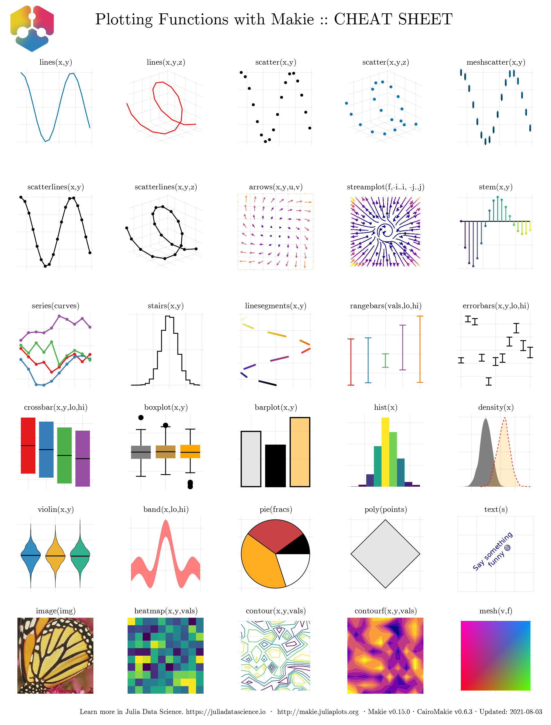
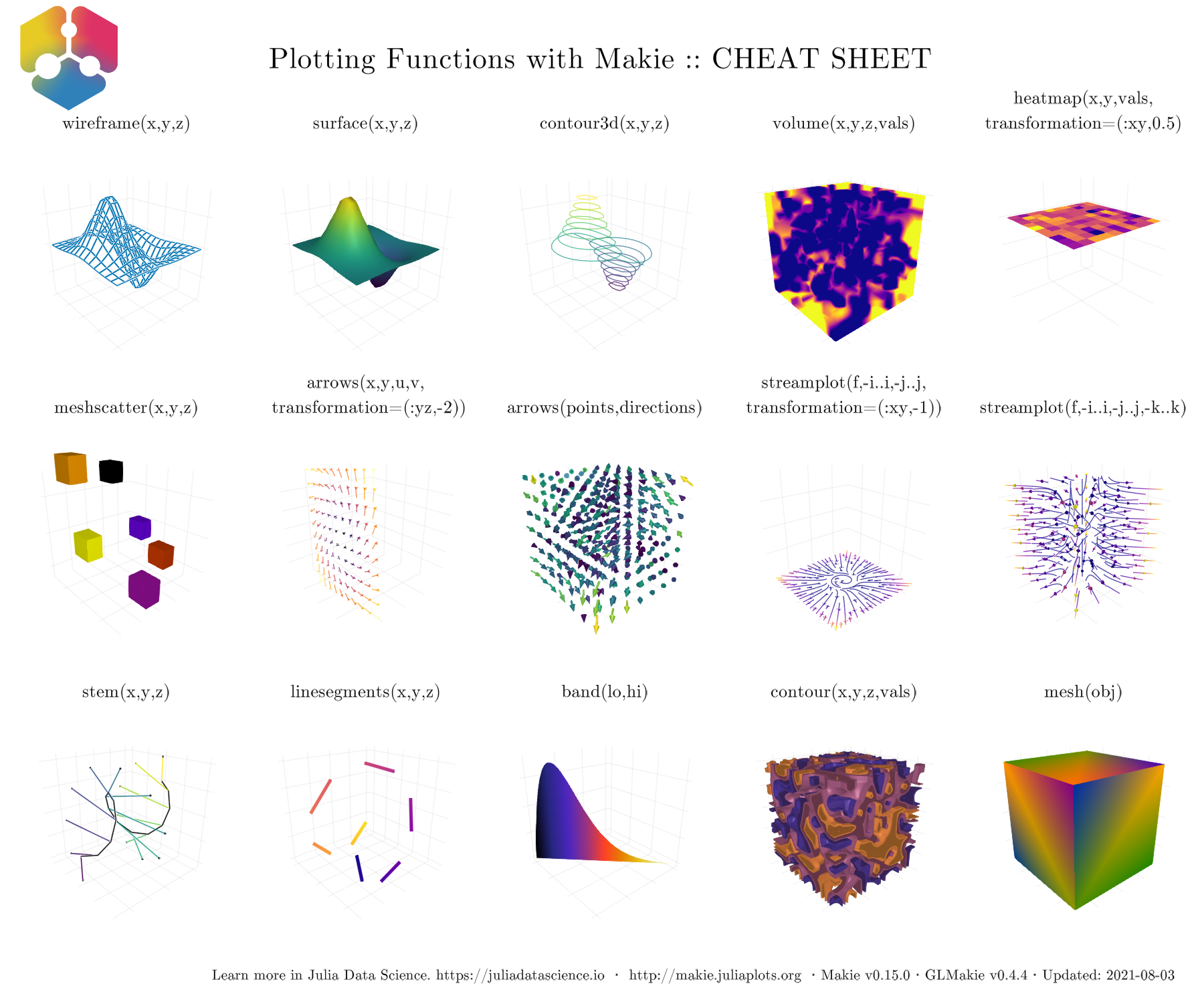
图 10 展示了 GLMakie.jl 的_cheat sheet_ ,这些函数支持绘制大多数 3D 图。 这些将在后面的 GLMakie.jl 节进一步讨论。
现在,我们已经大致了解到能做什么。接下来应该掉过头来继续研究基础知识。 是时候学习如何改变图的整体外观了。